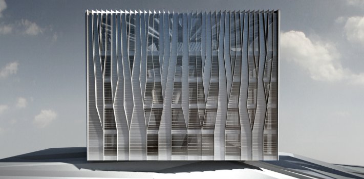
Plasma has been selected among some of the leading Chinese and China-based international offices for the next phase of development in Ordos, Inner Mongolia: after the shortfalls of Ordos 100 (lack of cohesiveness, contextual relationships and overall identity) have become clear, the local planning authority is seeking to explore new ways of procuring innovative and high-quality architecture through the establishment of codes and rules.
Ordos 20+10
TYPE Offices, Retail
STATUS Commission, Design Development
LOCATION Ordos, Inner Mongolia, China
YEAR 2010-2012
CLIENT Undisclosed
DESIGN TEAM Jorge Ayala, Eva Castro, Evan Greenberg, Ulla Hell, Holger Kehne, Nicola Saladino, Chuan Wang
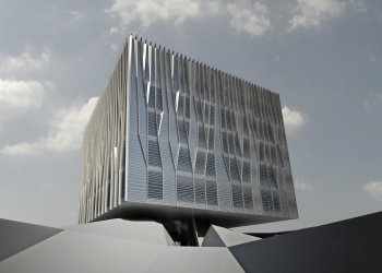
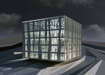
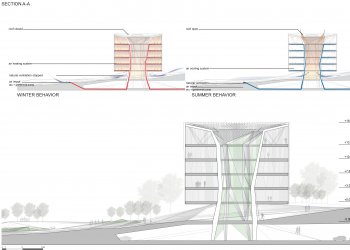
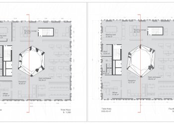
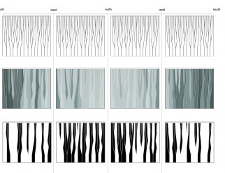
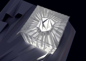
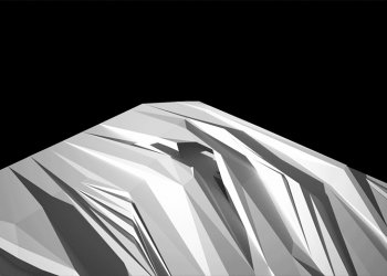
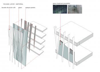
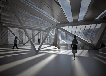
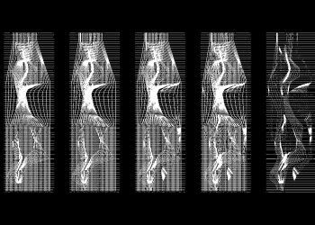
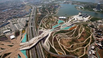
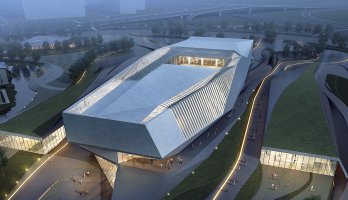
Each architect has been given a series of virtual volumes of which 75% of the vertices need to be retained. Plasma opted for a strategy that highlights and contrasts the Cartesian nature of the cubes with an expressive ground and internal core strategy. Given the fact that the ground is very loose and in many instances needs to be radically altered to suit the masterplan, Plasma Studio proposal is using these processes of artificially generated topography to produce a locally specific landscape – ripples, where the ground itself becomes a device for the organization of flows: flows of people, flows of cars (in the underground parking level) and finally flows of air (the air that is supplied to the various buildings will be channelled and preconditioned through a system of underground ducts). In this way, the ground itself operates as a multilayered and intense metabolic system whilst offering continuity to the Mongolian undulating landscape. Finally, there is no opposition between landscape and buildings. Neither is subordinating the other- they need each other to coexist. We propose the use of glass slots to bring light into the car parking and a develop series of cuts that enable pedestrian movement between the upper and lower layers. Mounts appear to support the buildings and hide a plethora of underground programmes. In this way, nothing spoils the sculptural composition of ground shape and buildings. The paths themselves are forming a tessellated mesh that enables multiple choices of routes. Walking along with them, the visitor experiences the building facades from opaque towards fully transparent. Just as the landscape is multitasking so do the voids: they function as light well, structure and service provider simultaneously. With floor plans between 24 and 32 Meters deep it needed to be introduced light wells breaking the traditional hierarchical rule where space on the edges is of better quality, becoming worse the more one gets towards the centre. Now the plan works as a ring without those black spots.
