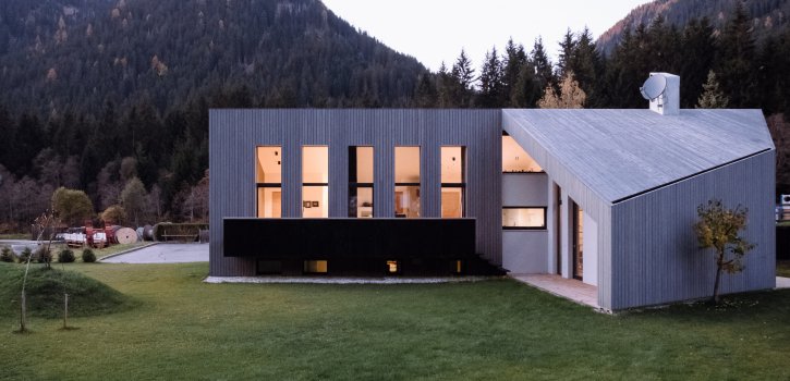
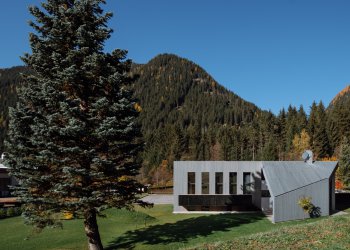
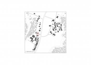
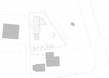
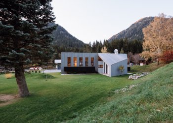
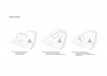
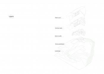
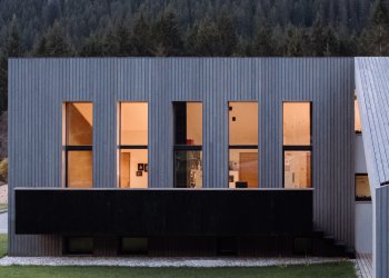
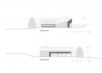
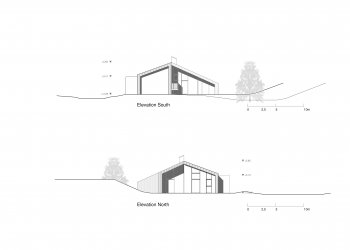
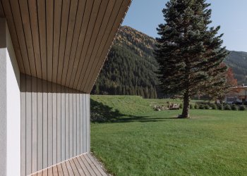
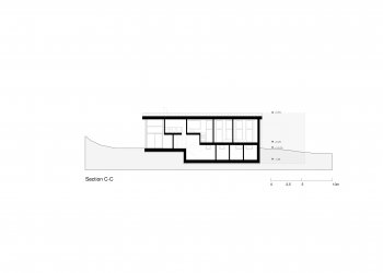
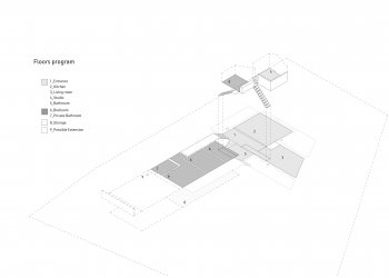
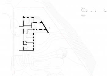
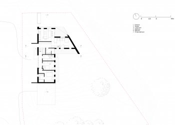
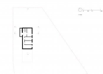
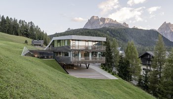
The construction site is located in a protected area, with an old silver fir in the centre – around it, a L-shaped building has been built, it looks like a bungalow. The volume separates itself from the surrounding commercial buildings and focuses on the green space around the old tree.
House L
TYPE Residential, Interior
STATUS Commission, Built
LOCATION St. Martin, Gsies, Italy
YEAR 2018
CLIENT Private
DESIGN TEAM Eva Castro, Micol Fronza, Ulla Hell, Holger Kehne, Peter Pichler, Chuan Wang
COLLABORATORS Team 4, Klaus Seeber
PHOTO CREDIT Michael Pezzei
The construction site is located in a protected area, with an old silver fir in the centre – around it, a L-shaped building has been built, it looks like a bungalow. The volume separates itself from the surrounding commercial buildings and focuses on the green space around the old tree.
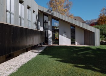
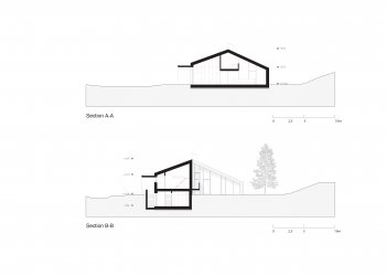
The parts of the building used at daytime are positioned in the northern access level of the site. These ground floor living areas are preceded by generous covered terraces on the garden side.
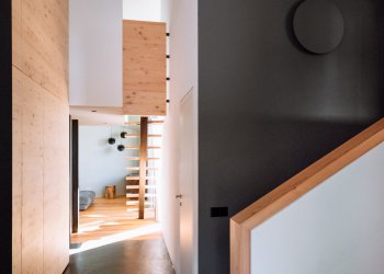
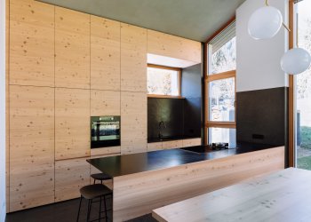
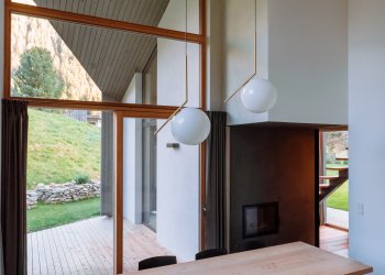
The spatial center is arranged around a fireplace, which is assigned to both kitchen and living room. The position of the kitchen is chosen in order to be touched by the morning sun, that of the living room brings the afternoon and evening sun deep into the room. These rooms extend almost up to a double height. A gallery stretched in between and the sloped roof give a great spatial experience.
The bedrooms are set up in a split-level organization, have a cellar and are preceded by a simple balcony which also gives access to the garden.
The building is identified by a very reduced material palette:
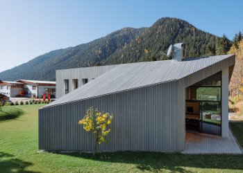
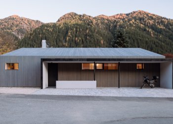
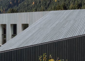
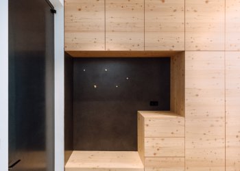
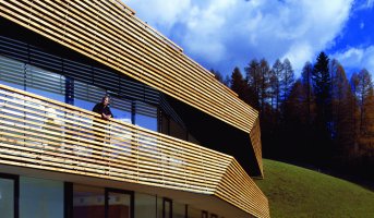
The west and east facades are cladded in dark, vertical sawn-rough boards. This covering extends as a continuum over the inclined roof, which from north and south is perceived as a pitched roof. Additive elements on the east and west sides, such as the canopy and the balcony, are made of galvanized and blackened steel. The north and south façades are set back in relation to the wood paneling, so that they are perceived as a framing. The interior is dominated by larch and pine wood. Dark shades of gray are used as targeted contrasts.
